



Why a Figma Design Looks Different on a Live Website
Have you ever wondered why a Figma design looks different from the live website after development? This is one of the most common issues designers and developers encounter during the transition from design to a real website.
A Figma design can look absolutely perfect.
The spacing is clean.
The typography feels balanced.
The images sit exactly where they should.
The buttons look aligned.
Everything appears polished.
Then the developer builds it.
You open the live website and suddenly something feels wrong.
The heading wraps onto two lines.
The button is slightly lower than it was in Figma.
The hero image looks different.
The mobile version feels cramped.
The navigation doesn’t have the same visual balance.
And sometimes the designer says, “This doesn’t look like my design.”
The developer replies, “But I followed the Figma file.”
Both can be right.
After working across design and web development, I’ve found that the problem usually isn’t that someone failed to copy the design. The bigger problem is that Figma and a real website are two different environments.
A Figma canvas is a controlled design environment.
A website has browsers, devices, real content, fonts, network conditions, CSS, JavaScript, image loading, responsive breakpoints and countless other variables.
That difference explains why a Figma design looks different after development.
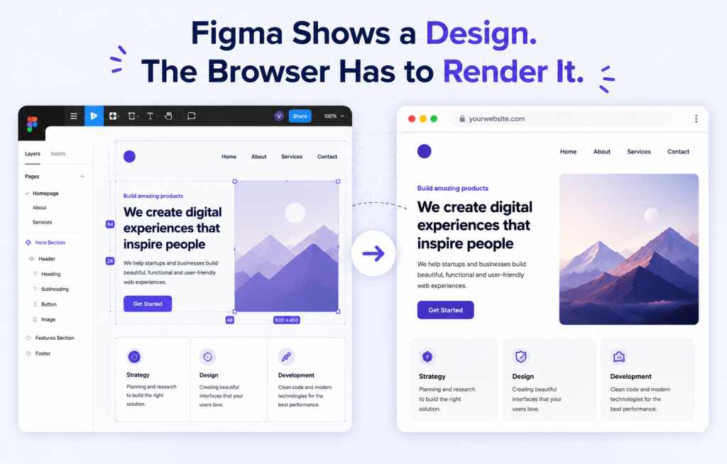
1. Figma Shows a Design. The Browser Has to Render It.
This is the first thing that designers and developers sometimes underestimate.
In Figma, you’re looking at a controlled composition.
You decide exactly where an element sits.
You decide its width.
You decide the font.
You decide the image.
You decide the spacing.
The browser doesn’t simply “display the Figma.”
The developer has to translate those visual decisions into HTML, CSS and other technologies that the browser can interpret.
Figma itself provides developers with measurements, layout properties, typography information, assets and even code snippets through Dev Mode. But these tools are designed to help with implementation—they don’t turn a Figma design into an automatically perfect production website.
That’s where the first differences start appearing.
2. Fonts Are One of the Biggest Reasons
Fonts are one of the main reasons a Figma design looks different after it is implemented in a browser.
A designer creates a beautiful heading in Figma.
The font looks perfect.
The line breaks are perfect.
The spacing looks balanced.
Then the website loads a slightly different font—or the intended font loads differently—and suddenly the entire section changes.
Why?
Because fonts aren’t just visual decoration.
They affect the dimensions of text.
A different font can change:
- character width
- line height
- word wrapping
- heading height
- paragraph height
- button width
- vertical spacing
- the position of elements below the text
Web browsers also have to download and render web fonts. If the intended font isn’t immediately available, a fallback font may be displayed first and then replaced by the web font. That replacement can cause visible layout changes.
So when a developer says:
“The font is correct, but the heading still looks different.”
That isn’t necessarily an excuse.
Font rendering and loading can genuinely affect the final appearance.
What I do now
Before considering a design “finished,” I check:
- exact font family
- font weight
- font file being used
- line height
- letter spacing
- fallback font
- desktop and mobile wrapping
A 1–2px difference in typography can become a surprisingly large visual difference when it affects an entire section.
3. The Text in Figma Is Usually Too Perfect
This is another problem that doesn’t become obvious until development starts.
Imagine a Figma design containing:
“Build a Better Digital Experience for Your Business”
The designer may have created the heading using exactly that text.
It fits beautifully.
But what happens when the real client changes it to:
“Build a Better Digital Experience for Your Growing Business”
One additional word can completely change the layout.
The heading might now take three lines instead of two.
The paragraph below moves down.
The button moves down.
The image alignment changes.
The entire hero section feels different.
This is why I don’t treat placeholder or perfectly controlled Figma content as proof that the layout is production-ready.
A good website needs to survive real content, not just the exact sentence shown in the design.
4. Responsive Design Is Not Just “Make Desktop Smaller”
Responsive behavior is another reason a Figma design looks different across devices and screen sizes.
This is probably one of the biggest misunderstandings between design and development.
A designer might provide:
- desktop design
- tablet design
- mobile design
But a real website has hundreds of possible viewport widths.
A user might visit at:
1366px
1280px
1180px
1024px
912px
768px
540px
390px
375px
The developer can’t manually reproduce a separate Figma screen for every possible width.
The developer has to create rules that work between those designs. Responsive layouts rely on techniques such as flexible layouts and CSS media queries to adapt interfaces to different viewport sizes.
That means deciding:
- when columns should collapse
- when navigation should change
- how typography scales
- how padding changes
- how images resize
- where breakpoints should occur
- whether elements should wrap or stack
So sometimes a website can match the Figma desktop design almost perfectly and still look wrong at 1100px.
That’s not necessarily a bad implementation.
It may simply mean the design didn’t define what should happen between the supplied layouts.
5. A Figma Image Doesn’t Behave Like a Real Website Image
This one causes a lot of visual differences.
In Figma, an image can be positioned exactly inside a frame.
On a website, the developer has to decide how that image behaves when the container changes.
For example:
Figma:
Image = 600 × 500
Container = fixed

Website:
Container = fluid
Image = responsive
Viewport = constantly changing
Now the developer has to choose between things such as:
object-fit: coverobject-fit: contain- different aspect ratios
- responsive image sizes
- cropping
- focal positioning
And the result may not look exactly like the Figma composition.
There’s also a performance consideration.
Images without explicit dimensions can cause layout shifts because the browser may not know how much space the image will require until it loads. Google recommends reserving the appropriate space for images to reduce this type of layout instability.
So sometimes the developer deliberately changes the implementation to make the real website perform better.
That can be a good thing.
6. “Pixel Perfect” Doesn’t Always Mean Better
This is something I learned from actual development work.
A designer may want a section to look exactly like the Figma file.
But suppose achieving that requires:
- unnecessary absolute positioning
- fixed heights
- excessive CSS overrides
- oversized images
- complicated responsive rules
- extra JavaScript
- poor accessibility
- fragile layouts
Should the developer still reproduce it exactly?
Not always.
A website isn’t a screenshot.
It’s a living interface.
Users resize it.
They zoom it.
They change their browser settings.
They use different devices.
They have different content.
They may use slower connections.
They may load different languages.
They may interact with components in ways that aren’t visible in a static design.
The goal shouldn’t simply be:
“Make the website look like Figma.”
The better goal is:
“Translate the design system into a robust website that preserves the intended visual experience.”
That’s a much more useful definition of pixel accuracy.
7. Spacing Can Change Because of Content
This is one of those problems that looks like a CSS mistake but isn’t always one.
Suppose your Figma design has:
Heading
↓ 24px
Paragraph
↓ 32px
Button
Everything looks perfect.
But the paragraph in the real website is two lines longer.
Now the button naturally moves down.
A developer could force the button back into the original position with absolute positioning.
But that would create a new problem.
What happens when the paragraph becomes even longer?
The button overlaps.
Or the section becomes broken on mobile.
This is why flexible layouts are usually better than trying to force every element into the exact coordinates from a static design.
8. Browser Rendering Is Not Figma Rendering
This is another important distinction.
Figma itself is a browser-based design application and uses WebGL for rendering.
But the website you’re building is being rendered as an actual web page by the browser’s HTML/CSS layout and rendering engine.
That means you’re not comparing:
Figma → Screenshot
You’re really comparing:
Figma’s design environment → Browser layout engine → Device → Actual content
There are more variables involved.
This becomes especially noticeable with:
- typography
- shadows
- gradients
- filters
- animations
- SVGs
- fractional pixel values
- image scaling
- browser-specific behavior
Small differences can accumulate.
9. The Designer May Not Have Designed the States
Another common problem is that the Figma file shows only the “happy path.”
For example, a button might look perfect in its default state.
But what about:
- hover
- focus
- active
- disabled
- loading
- error
- long text
- keyboard navigation
Or consider a form.
The Figma design might show:
Name: [____________]
But the real website needs:
- empty state
- focused state
- invalid input
- validation message
- long name
- mobile keyboard
- successful submission
The developer has to create these states even when they aren’t explicitly visible in the original design.
That’s another reason the final website can differ from the original Figma file.
10. Design Changes After Development Has Started
This happens more often than people admit.
A developer starts building.
Then the designer changes:
- heading size
- button style
- spacing
- colors
- section height
- image
- component
But the developer may already have implemented the earlier version.
Figma supports version history and comparison in Dev Mode specifically because design-to-development work is iterative and designs can change during implementation.
This is why a simple process can save hours:
Before development → confirm the final design version.
During development → communicate changes.
Before launch → perform a visual QA pass.
What I’ve Learned From Building Websites
The biggest lesson is that the designer and developer shouldn’t treat Figma as a picture that must be copied.
Figma should be treated as a visual specification.
It communicates:
- hierarchy
- typography
- spacing
- colors
- components
- interactions
- visual priorities
- responsive intent
The developer’s job is then to translate those principles into a system that works with real browsers and real users.
And the designer’s job doesn’t necessarily end when the Figma file is handed over.
The best results usually happen when the designer looks at the actual implementation and gives visual feedback.
Because sometimes you don’t discover a problem until you see the design running in a browser.
My Practical Figma-to-Website Checklist
Before calling a website finished, I recommend checking it at least at:
Desktop
- 1920px
- 1440px
- 1366px
- 1280px
- 1024px
Mobile
- 430px
- 414px
- 390px
- 375px
And check:
Typography
- Is the correct font loading?
- Are font weights correct?
- Are line heights correct?
- Are headings wrapping naturally?
Layout
- Is spacing consistent?
- Are containers behaving correctly?
- Are sections flexible?
- Are there unnecessary fixed heights?
Images
- Are aspect ratios correct?
- Is cropping correct?
- Are image dimensions reserved?
- Are responsive images being used appropriately?
Responsive behavior
- Does the design work between the provided Figma frames?
- Does navigation behave correctly?
- Do columns collapse properly?
- Do buttons remain usable?
Real content
- What happens with a longer heading?
- What happens with a longer paragraph?
- What happens with a missing image?
- What happens with a longer button label?
Interaction
- Hover
- Focus
- Active
- Disabled
- Loading
- Error
- Success
The Real Reason Your Website Doesn’t Look Exactly Like Figma
In most cases, it’s not because the developer is bad.
And it’s not necessarily because the designer made a bad design.
It’s because a static design and a functional website are fundamentally different things.
Figma gives you a controlled visual environment.
The web gives you variables.
Different screens.
Different browsers.
Different fonts.
Different content.
Different network conditions.
Different user behavior.
The real skill is not copying every pixel from Figma.
The real skill is knowing which pixels matter, which rules matter, and which differences are acceptable because the website needs to function in the real world.
That’s where good design and good development actually meet.
Final Thought
After working on both design and development, I’ve come to believe that the best websites aren’t the ones where someone blindly reproduced a Figma file.
They’re the ones where the developer understood why the design looks the way it does and then rebuilt that visual logic in a way that works on the web.
That’s the difference between simply converting a design into code and actually building a good website.
Figma is the blueprint. The browser is the real environment.
And the gap between those two is where most of the interesting problems begin.
Conclusion
Understanding why a Figma design looks different helps designers and developers create better websites.










Helpful article